At some point, almost every SME owner has had the same experience. You put effort into your website, you share the link, you drive some traffic to it, and then... not much happens. A few visits, maybe the odd enquiry, but nothing close to what you were hoping for. The natural conclusion is that you need more traffic. More ads, more social media posts, more SEO. So you spend more on getting people to the site, and the results are still underwhelming, because the problem was never the traffic. It was what happened to the traffic once it arrived.
Most SME websites don't convert not because they're ugly or broken, but because they were built with the wrong goal in mind. They were built to look credible enough to share, to give the business an online presence, to have something to point people to. Those are reasonable goals for a first website. But they're not the same as building something designed to turn a curious stranger into a warm, interested enquiry. And that distinction is where most of the money being spent on marketing quietly disappears.
Your Website Has One Job
Before getting into what most SME websites get wrong, it helps to be clear about what a business website is actually supposed to do. At its most fundamental level, a website exists to take someone who has shown enough interest to visit, and move them to take a specific next step. That next step might be filling in an enquiry form, sending a WhatsApp message, booking a call, or making a purchase. Everything on the website, every word, every image, every button, should be working toward that outcome.
Most SME websites are not built this way. They're built as a collection of information about the business, organised in a way that makes sense to the owner, without a clear thread pulling the visitor toward any particular action. The result is a site that informs without persuading, one that answers the question "what does this business do?" but never quite answers "why should I get in touch right now?"
That single shift in perspective, from "here is information about us" to "here is everything you need to feel confident taking the next step," is the most important reframe in website thinking for any SME owner.
The Homepage Is Usually the Biggest Problem
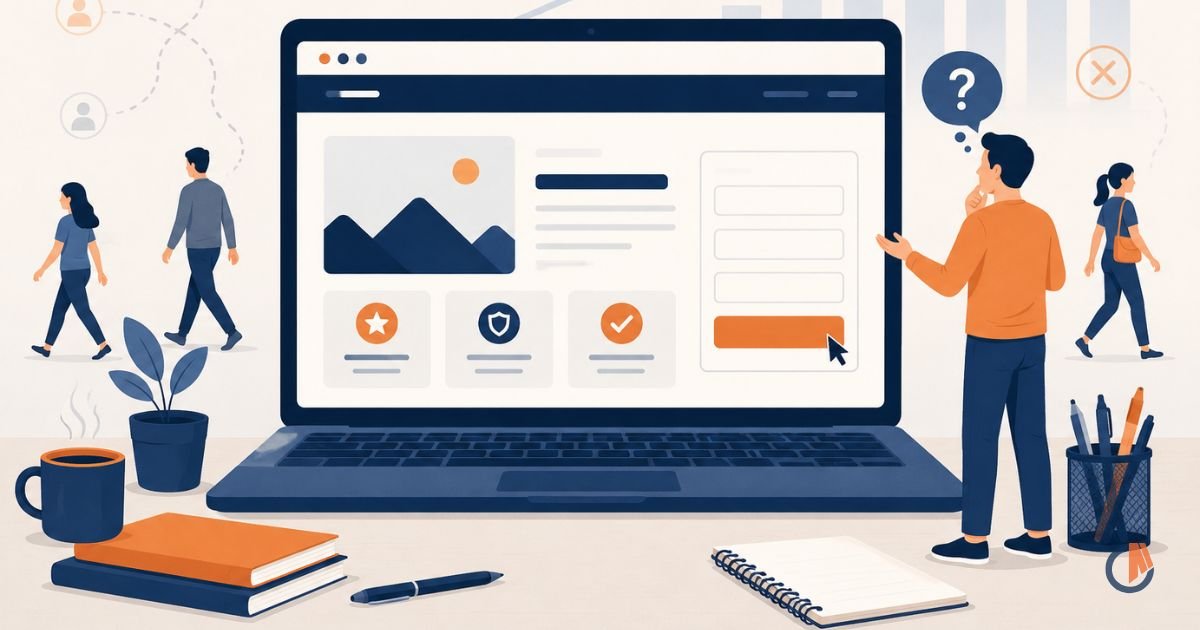
The homepage is the most visited page on almost every business website, and it's the one that tends to have the most conversion problems. This is partly because it tries to do too many things at once. It wants to introduce the business, explain all the services, tell the brand story, show the team, display client logos, and link to the blog, all on a single page. The result is a page that's busy, unfocused, and easy to leave without doing anything.
A homepage that converts well does something much simpler. It answers three questions quickly and clearly: what do you do, who is it for, and what should I do next? If a visitor can get clear answers to all three within the first few seconds of landing on the page, the chances of them sticking around and taking action increase dramatically. If they have to scroll, read carefully, and piece it together themselves, most of them won't bother.
The headline at the top of your homepage is doing more work than almost any other element on the site. It's the first thing most visitors read, and it determines whether they keep reading or leave. A headline that leads with your business name or a vague statement like "your trusted partner for growth" tells the visitor almost nothing useful. A headline that immediately addresses who you help and what changes for them when you do is a completely different experience. It makes the right person feel seen, which is the first step toward making them feel comfortable enough to enquire.
Too Many Choices Kill Decisions
One of the most well-documented patterns in consumer psychology is that more choices lead to fewer decisions. When a visitor arrives at your website and is presented with six different services, four different ways to get in touch, a newsletter signup, a link to your blog, and a pop-up asking them to follow you on Instagram, the cognitive load becomes too high. The easiest way to resolve that overwhelm is to leave the page and come back later, which usually means never coming back at all.
The most effective websites are opinionated about what they want visitors to do. They make one primary action more obvious than everything else. The call to action button is clear, prominent, and repeated at the right moments as the visitor scrolls. Everything else on the page supports that single direction rather than competing with it.
This doesn't mean your website can only have one page or one service. It means that at any given point in the visitor's journey through your site, they should know exactly what they're being invited to do next. A clear, logical path from arrival to action is what separates a website that converts from one that just gets visited.
Copy That Talks About You Instead of Them
This ties back to the messaging article earlier in this series, but it's worth addressing specifically in the context of websites because it's so pervasive. The majority of SME website copy is written from the business's perspective, describing what the business does, what its values are, how long it has been operating, and what makes it unique. All of that might be true and worth knowing, but it's not what convinces someone to get in touch.
People make decisions based on what's in it for them. They come to your website with a problem or a need, and they're looking for evidence that you understand that problem and can solve it better than the alternatives. Copy that speaks directly to the visitor's situation, their frustrations, their goals, what they're worried about getting wrong, is copy that holds attention and builds the kind of trust that leads to action.
A useful test is to read through your website copy and count how many times the word "we" or your business name appears in the first paragraph of each section, versus how many times "you" appears. Most SME websites are heavily weighted toward "we." Flipping that balance toward "you" is one of the simplest and most effective changes you can make to improve how your site performs.
No Clear Reason to Act Now
Even when a website communicates clearly and builds genuine interest, it often fails to give the visitor a compelling reason to take action today rather than sometime later. "Sometime later" almost always means never, because the moment someone leaves your site their attention moves on and the window closes.
This doesn't mean you need fake countdown timers or manufactured urgency. It means your website should make a clear, genuine case for why getting in touch is worth the visitor's time right now. That might come from framing the cost of inaction, the sooner you sort this out, the sooner the problem stops costing you. It might come from making the first step feel so low-commitment and easy that there's no real reason to delay. A "let's have a conversation" framing converts better than "request a quote" for most service businesses, because it reduces the perceived risk of reaching out.
The goal is to make taking the next step feel like the obviously sensible thing to do, rather than something that requires a big decision. Reducing the perceived weight of the initial contact is one of the most effective levers available on any service business website.
Slow Load Times and Mobile Experience
This is more technical than the other points, but it's worth including because it's a conversion killer that many SME owners don't realise is affecting them. A significant portion of website visitors in Malaysia are browsing on mobile, and if your site loads slowly or doesn't display well on a phone screen, a large percentage of your traffic is having a frustrating experience that ends in them leaving before they've seen anything meaningful.
Page speed matters more than most people think. Research consistently shows that visitors start abandoning pages after just a few seconds of waiting for them to load. Every additional second of load time reduces conversions meaningfully. Images that haven't been compressed, plugins that add unnecessary weight, and hosting that isn't up to the job all contribute to a slower site that loses visitors before the copy even has a chance to do its work.
Testing your website on your own phone, on a mobile data connection rather than your office WiFi, is a quick and sobering exercise. If the experience feels slow or clunky to you, it feels the same way to every visitor coming in from a paid ad or a social media post.
No Social Proof Where It Matters Most

We covered social proof in the credibility article, but its placement on the website deserves specific attention here. Testimonials and case studies that are buried on a separate page, or only appear at the very bottom of a long homepage, are not doing the conversion work they could be doing. Social proof is most effective when it appears at the exact moment a visitor is making a judgement call.
If someone is reading your services page and considering whether to enquire, a relevant testimonial from a client who was in a similar situation should be right there on that page, next to the service description, not somewhere they have to go looking for it. If your homepage asks visitors to get in touch, a short, specific testimonial positioned just above or below that call to action reduces the hesitation that stands between interest and action.
Think about where doubt is most likely to arise as someone moves through your website, and put your strongest social proof at exactly those points. That's how testimonials and case studies move from nice-to-have decoration to active conversion tools.
Fixing Your Website Is Not Always About Redesigning It
One thing worth saying clearly: improving your website's conversion rate doesn't necessarily mean starting from scratch or paying for a full redesign. Some of the most impactful changes are purely about copy, rewriting the headline, tightening the value proposition, shifting the focus from the business to the customer. Others are about structure, simplifying the navigation, making the call to action more prominent, removing the elements that distract from the main goal.
Before assuming that a new website is the answer, go through what you already have with fresh eyes and the questions in this article. What is the homepage actually asking visitors to do? Does the copy speak to them or about you? Is the path from arrival to enquiry clear and easy to follow? Is there social proof in the right places? Does it load quickly on mobile? The answers will tell you whether you need a rebuild or just a focused set of improvements, and very often it's the latter.
Your website is the hardest-working salesperson your business has. Unlike a real salesperson, it's available around the clock, it never has an off day, and it's talking to potential customers even when you're asleep. The question is whether it's actually doing the job, or just showing up and hoping for the best.
Wondering Why Your Website Isn't Generating More Enquiries?
It's one of the most common conversations we have at Creative Mojo. A business is spending time and money driving traffic to a website that isn't converting, and nobody has taken the time to look at the site itself and ask why. Sometimes the fix is simpler than expected. Sometimes it's more involved. Either way, it starts with an honest look at what the site is currently doing and what it should be doing instead. If you'd like a fresh pair of eyes on your website and a straight conversation about where it's falling short, reach out to us here and let's take a look together.
Is this your situation right now?
If you are spending on marketing but not seeing the returns, a clarity conversation is usually where we start. Tell us about your business and we will give you an honest read on what is going on.
Book a Free Discovery Call